# Tutorial: Display widget configuration data
So, we already created a react micro frontend widget and configuration screen to customize a name field.
In this tutorial we will display that field in our micro frontend widget.
# Add an attribute to the custom element
Edit WidgetElement to add attribute handling to the custom element,
and make re-render our app when an attribute changes. Now, the name
attribute is being read from the custom element and passed as a prop to
the react root component (App).
import React from 'react';
import ReactDOM from 'react-dom';
import App from './App';

const ATTRIBUTES = {
  name: 'name',
};

class WidgetElement extends HTMLElement {

  static get observedAttributes() {
    return Object.values(ATTRIBUTES);
  }

  attributeChangedCallback(name, oldValue, newValue) {
    if (!Object.values(ATTRIBUTES).includes(name)) {
      throw new Error(`Untracked changed attribute: ${name}`);
    }
    if (this.mountPoint && newValue !== oldValue) {
      this.render();
    }
  }

  connectedCallback() {
    this.mountPoint = document.createElement('div');
    this.appendChild(this.mountPoint);
    this.render();
  }

  render() {
    const name = this.getAttribute(ATTRIBUTES.name);
    ReactDOM.render(<App name={name} />, this.mountPoint);
  }
}

customElements.define('my-widget', WidgetElement);

export default WidgetElement;
Note
attributeChangedCallbackis also a custom elements lifecycle hook method.
# Make react component handle the input
Edit the App component now, to make it display the name prop.
import React from 'react';
import './App.css';

function App({name}) {
  return (
    <div className="App">
      <header className="App-header">
        <p>
          Hello, {name}!
        </p>
      </header>
    </div>
  );
}

export default App;
Now, to ensure our custom element is working we can edit
public/index.html and set a value for the name attribute of the
custom element.
<!DOCTYPE html>
<html lang="en">
  <head>
    <meta charset="utf-8" />
    <link rel="shortcut icon" href="%PUBLIC_URL%/favicon.ico" />
    <meta name="viewport" content="width=device-width, initial-scale=1" />
    <title>React App</title>
  </head>
  <body>
    <my-widget name="Marco"/>
  </body>
</html>
After page reload, you should be able to display a simple "Hello, Marco!" message.
# Rebuild the widget
From the react project root, type:
npm run build
and the build/static directory will be (re)generated. Copy it again
into the Entando 6 instance under
src\main\webapp\resources\static\my-widget, then rename
a file like
js/runtime~main.c7dcdf0b.jstojs/runtime.js(bootstrapping logic)a file like
js/2.230b21ef.chunk.jstojs/vendor.js(third-party libraries)a file like
js/main.1fd3965a.chunk.jstojs/main.js(app)a file like
css/main.d1b05096.chunk.jstocss/main.css(stylesheet)
Note
you could keep the original names in order to avoid potential caching issues, but then you will have to update the Custom UI field in the App Builder widget screen every time a new version of the widget is deployed.
If the application server you’re running does not have hot deploy enabled, restart it.
# Update the Entando 6 widget in App Builder
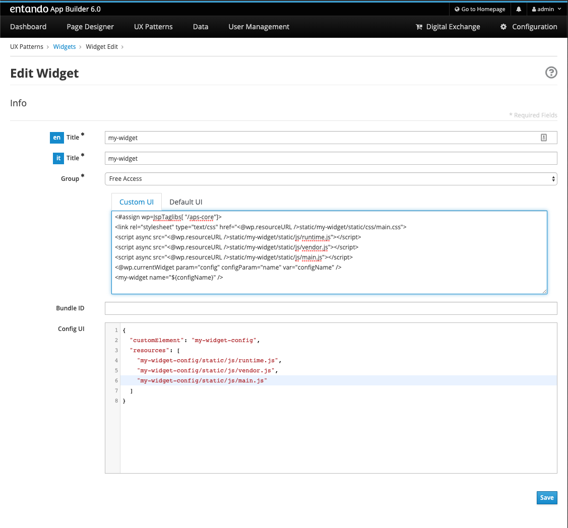
Open the Entando App Builder, go to UX Patterns → Widgets, find the widget My Widget and click to edit it.
You’ll see a screen like this one

Update the Custom UI field from:
<#assign wp=JspTaglibs[ "/aps-core"]>
<link rel="stylesheet" type="text/css" href="<@wp.resourceURL />static/my-widget/static/css/main.css">
<script async src="<@wp.resourceURL />static/my-widget/static/js/runtime.js"></script>
<script async src="<@wp.resourceURL />static/my-widget/static/js/vendor.js"></script>
<script async src="<@wp.resourceURL />static/my-widget/static/js/main.js"></script>
<my-widget />
to
<#assign wp=JspTaglibs[ "/aps-core"]>
<link rel="stylesheet" type="text/css" href="<@wp.resourceURL />static/my-widget/static/css/main.css">
<script async src="<@wp.resourceURL />static/my-widget/static/js/runtime.js"></script>
<script async src="<@wp.resourceURL />static/my-widget/static/js/vendor.js"></script>
<script async src="<@wp.resourceURL />static/my-widget/static/js/main.js"></script>
<@wp.currentWidget param="config" configParam="name" var="configName" />
<my-widget name="${configName}" />
We basically added a JSTL tag to extract a field (under configParam)
from the config field of the current widget and put it in a configName
variable, that we pass to the custom element.
Save the widget and reload the page that contains the widget: you’ll see "Hello, Marco!" as expected.